Designing a Virtual Protest Experience—From Scratch, in Ten Days—for Stand Up for Science
Stand Up for Science (SUFS) is a 501(c)(4) advocacy organization defending federal science, public health, and democratic institutions. I joined as Creative Director on a three-month contract in February 2025, stepping into a role with a big mission and very little runway.
My first major project was the second annual National Day of Action on March 7th—a simultaneous rally across 50+ cities with a flagship event in Washington, D.C. I came on two weeks before the event and led creative through event day: a multi-series social campaign, a Social Media Kit and other assets for local organizers, stage banners, and a same-night flyer printed morning-of. About 2,000 people showed up in D.C. Speakers included Rep. Jamie Raskin, Sen. Chris Van Hollen, and NIH whistleblower Jenna Norton. #StandUpForScience trended on Bluesky throughout the day.
That event showed SUFS could get people to take it to the streets for a traditional protest. Could we get them to take it to their screens for three virtual, accessible rallies?
My Role
Across all three virtual rallies, I was responsible for:
Creative strategy and visual direction for each event
All design: event graphics, web and social assets, speaker posts, countdown posts, sponsor treatments, and platform-specific materials
Developing a cohesive visual system that could scale across multiple formats and all three events
Coordinating creative timelines with communications, production, and logistics teams
Introducing a pre-launch readiness process to align all teams before go-live decisions
THE CHALLENGE
Ten Days. No Budget. No Map.
SUFS had never hosted a virtual rally. There was no template for what we envisioned. And we had just ten days to pull it off.
When leadership decided to host the first virtual rally, to coincide with Indivisible's No Kings 3 event, the creative challenge was enormous and undefined. More than a webinar or a Zoom town hall, it had to feel like a protest—with energy, presence, and political weight, while being accessible to everyone. The design had to carry that.
What We Were Up Against
No advertising budget—everything had to work organically across Instagram, Bluesky, Threads, TikTok, emails, and our website
No existing template—no prior virtual rally creative to build from
An unfamiliar format—we had to explain what a virtual rally even was to potential speakers and attendees
A ten-day window—from green light to live event
Really Requiring Accessibility
As a team, we decided the event had to be fully accessible: live ASL interpretation and captioning, real-time Spanish translation
That commitment had to be front and center in all promotion—it was a core part of the pitch to potential attendees who were excluded from, or couldn't attend, in-person events
Cross-team coordination was essential—social posts had to have live links to registration pages, and logistics details had to be locked before anything could go out
On top of the creative work, I was coordinating across teams simultaneously booking speakers, configuring Zoom, building the registration flow, and standing up a web presence. Social posts had to be informative and timely—which meant I needed to know when every piece was ready before I could publish anything.
THE SOLUTION
Building the Visual Language of a Virtual Protest
The Name Did Some of the Work
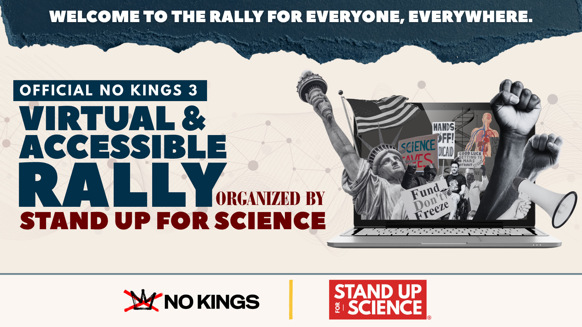
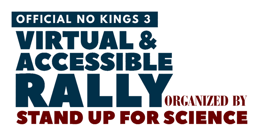
The first problem was clarity: people needed to immediately understand what this event was, who was behind it, and that it was accessible. So we named it exactly that: The First Official No Kings 3 Virtual and Accessible Rally, Organized by Stand Up for Science.
That's a lot of words—intentionally. I designed a type treatment that fit everything in without losing hierarchy. The key information was emphasized; the supporting details filled in around it. It was the first piece of communication design for the event.
The Key Visual: Protest on a Screen
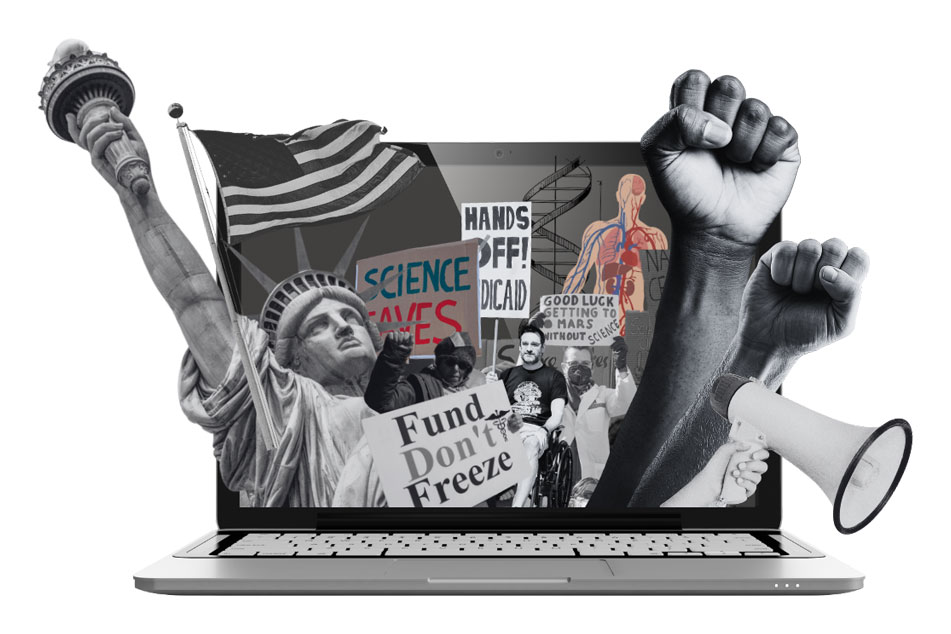
For the hero graphic, I needed something that communicated "protest," "virtual," "science," and some of the very American issues we were fighting for. It also had to feel urgent and unpolished—not like a corporate livestream.
The concept: classic protest elements—raised fists, rally signs, a megaphone—bursting out of a laptop screen, combined with American symbols like the Statue of Liberty (who is also basically raising her fist) and an American flag. I added science elements and protesters who reflect who actually shows up to a virtual rally: someone in a wheelchair, someone in a mask. Everything was layered in a grunge, imperfect, DIY protest aesthetic. The result feels familiar to anyone who's been to a protest, but makes clear this one was different, and happening digitally.
Templates That Could Keep Up
With ten days and a lot of moving parts, I built templates wherever I could:
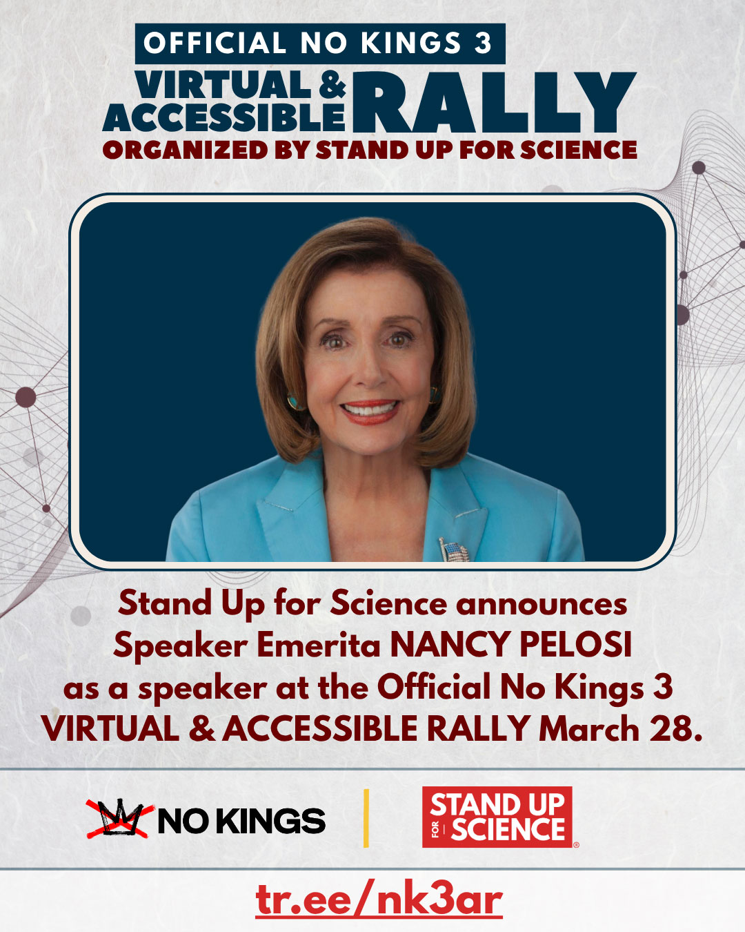
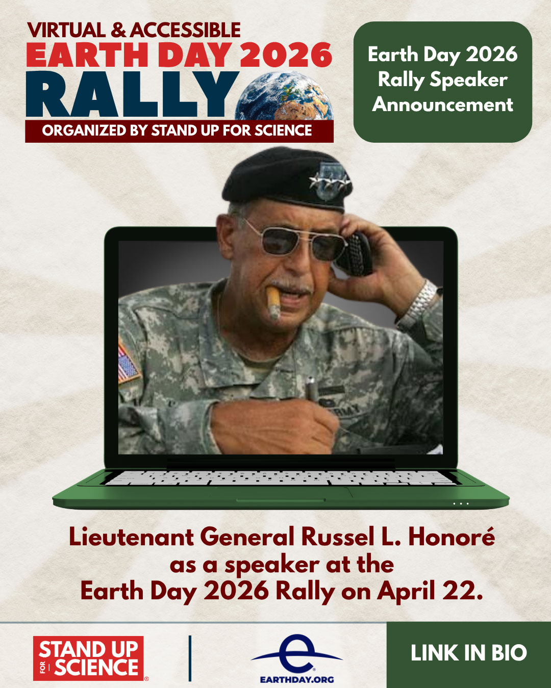
Speaker cards—designed to be updated quickly as confirmations came in
Sponsor treatments—a consistent format that worked with portrait, square, and landscape logos
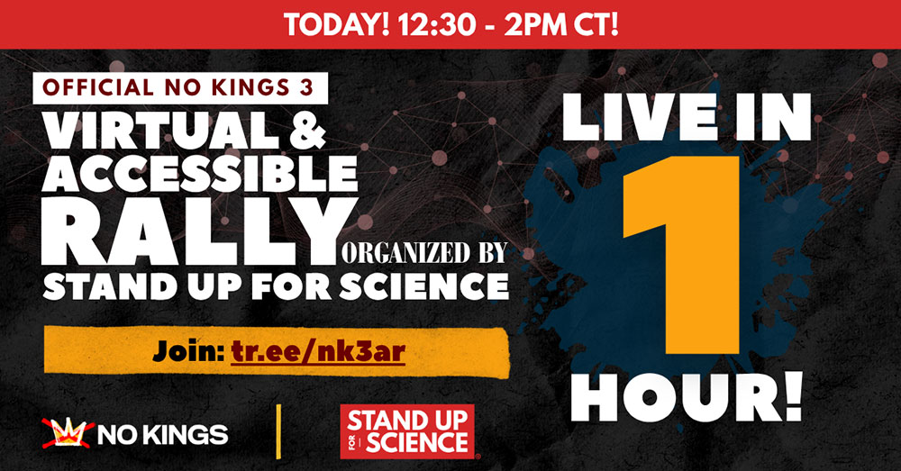
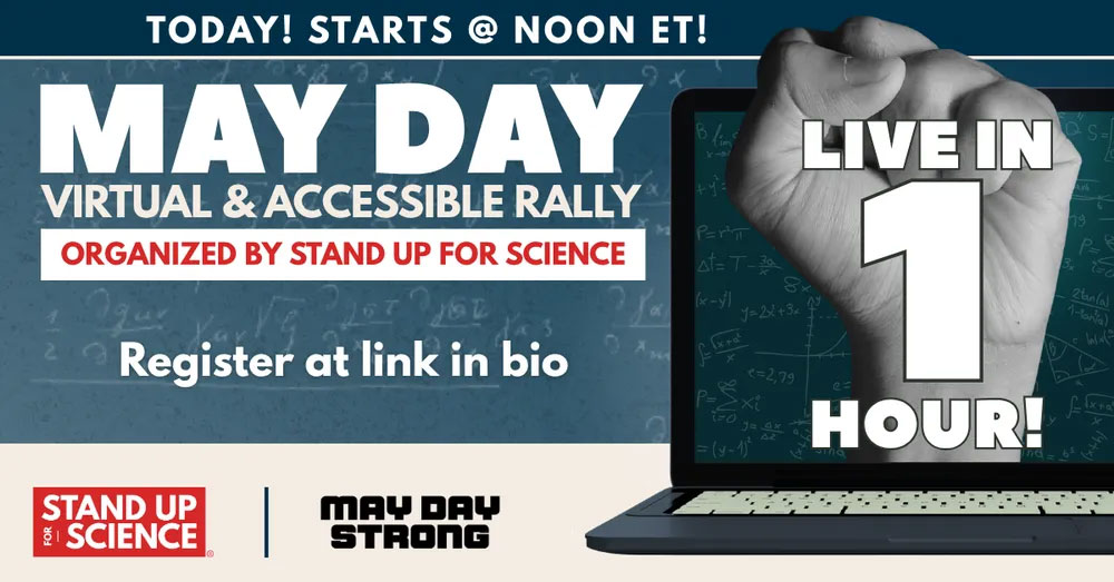
Countdown posts—adapted for virtual: "The event starts in [hours] / [minutes]!"—a small but meaningful shift that reminded people they could join with a single click
No Kings 3 Countdown
Earth Day Countdown
May Day Countdown
I mapped out ten days of steady content promoting the event broadly, focusing on specific topics and issues, and explaining what "accessible" actually meant. Every post had to have live links—which meant coordinating with other teams to know exactly when each piece was ready to go out.
A System That Scaled
Once No Kings 3 was behind us, SUFS hosted two more virtual rallies—Earth Day on April 22 and May Day on May 1—and I carried the visual system forward into both.
Earth Day Virtual Rally
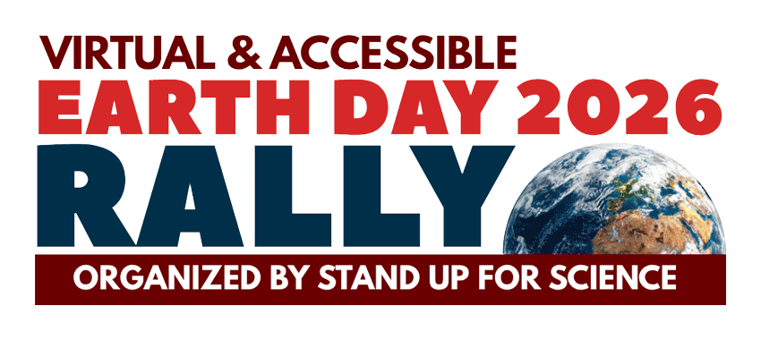
This event was a partnership with the Earth Day organization, so I developed a logo lockup to reflect the co-branding—a model I'd established with the No Kings treatment.
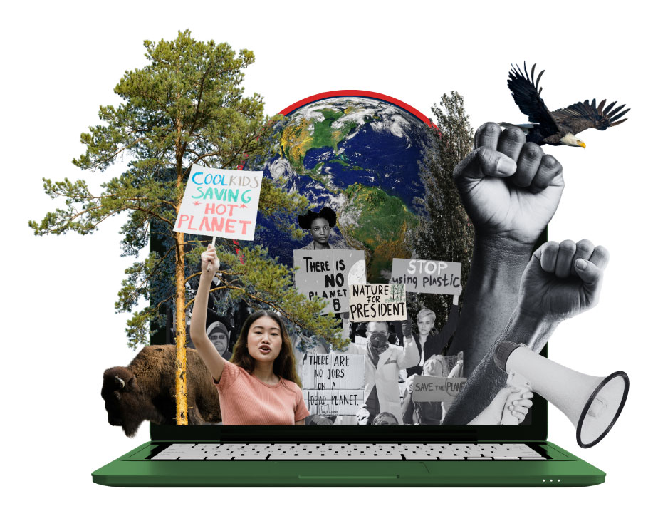
The laptop concept returned, this time in green with environmental elements: an earth, trees, environmental protest signs, and an eagle and buffalo as American symbols. The background is a soft, organic, earthy green burst. The event also moved to a new platform (BigMarker), which opened up additional real estate—platform-native graphics, waiting room screens, and promotional placements I hadn't had on Zoom.
May Day Virtual Rally
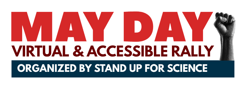
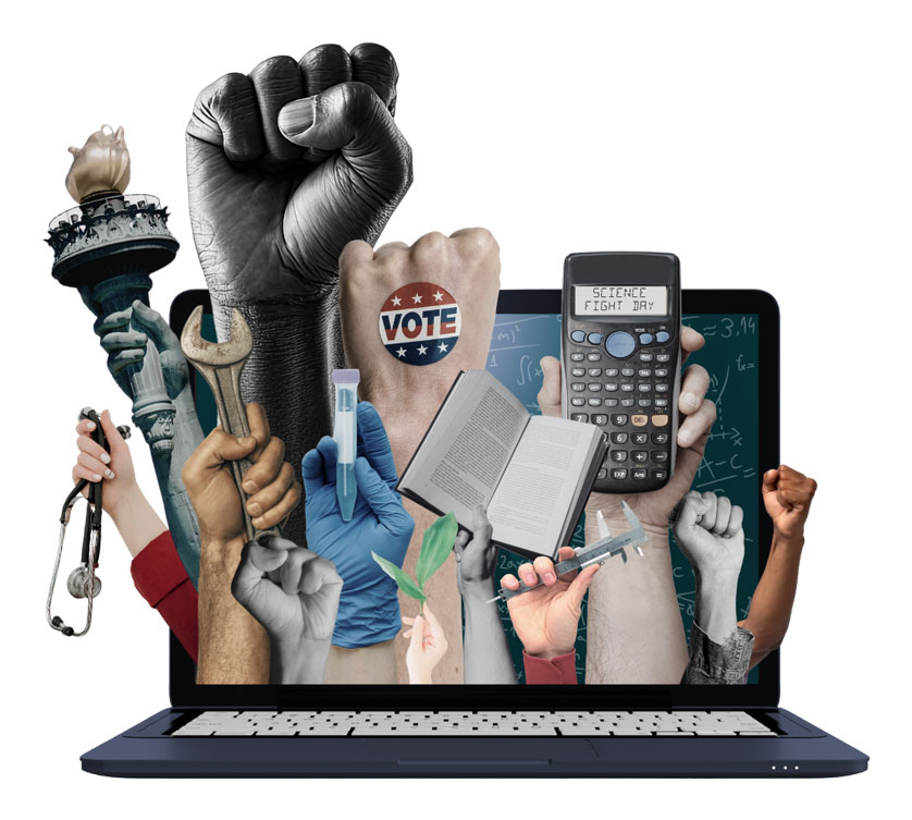
May Day brought another partnership and another lockup. For the main image, I shifted the protest imagery to center people of science: raised fists holding books, a calculator, a stethoscope. I went with a blue laptop (red might have felt more on-theme for May Day, but risked reading as political rather than scientific). The imagery was busier, but the message was still clear, with a background based on staunch democratic socialist Albert Einstein's notes. The text treatment shifted to lead with the event name, with "Virtual and Accessible" as a secondary detail.
By this point the system was genuinely reusable—each event felt distinct yet recognizably part of the same campaign.
Earth Day also came together on a tight timeline, and I formalized a pre-launch readiness process: before any go-live decision was made, I ran a go/no-go check with each team—communications, production, logistics—and helped any team that was "no go" work through what they needed to get there. It kept us from launching into preventable chaos.
RESULTS
No Kings 3: By the Numbers
Big-name speakers and over 8,400 attendees, including a community that finally felt seen.
The Numbers
11,400 registrants
8,400+ attendees
90 minutes average watch time
$25,000+ raised
64,250 site visits—10× the baseline
32 press mentions, including 9 international
Notable Speakers
Speaker Emerita Nancy Pelosi
Rep. Alexandria Ocasio-Cortez (D-NY-14)
House Democratic Leader Hakeem Jeffries
Skye Perryman, CEO, Democracy Forward
Syanne Bloom, Disability Justice Advocate
Beyond the Numbers
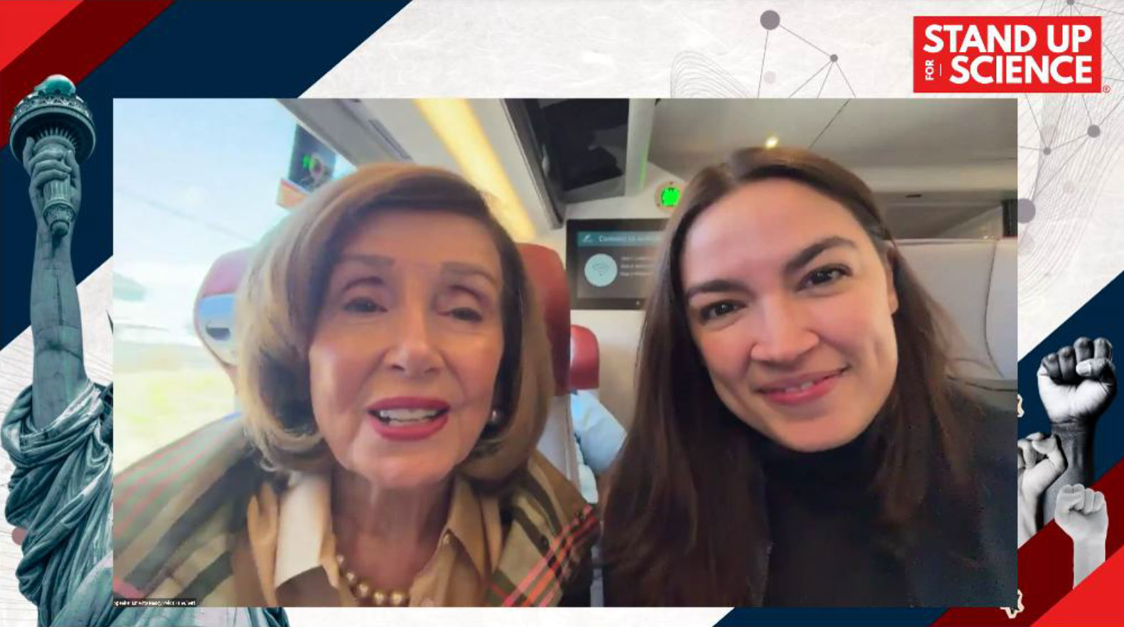
Speaker Emerita Nancy Pelosi not only delivered remarks—joining from the Amtrak Metroliner alongside Congresswoman Alexandria Ocasio-Cortez—but afterward asked the backstage team if she could stay on as a viewer, and watched the rest of the rally in full.
The response from the disability and accessibility community was unlike anything I'd seen from an event campaign. People who had been physically unable to attend in-person rallies—because of chronic illness, disability, immunocompromise, or caregiving responsibilities—found their way in. And they were vocal about it.
"I was on the virtual protest. I am disabled and bedridden and desperately wanted to go. This at least let my anger be counted and feel connected to others. For some of us, it is physically impossible to make our voices heard."
"Such an amazing platform for those who couldn't attend in person. Greatly appreciated the ASL interpreters along with the participants describing themselves. You've sparked a hope in me that I'll be forever grateful for!"
"Thank you SO much for doing this! As a single mom to autistic kids, I don't feel like I can go to in-person events. This was so great to be a part of something and to feel hope, in a way that I can fit into my day."
"I was bummed that I lacked access to the in-person protests because masks are not required and I'm immunocompromised—but that was 👏❤️💯✊ representation and intersectionality is fucking beautiful to see and SOOOOO needed."
"If you're disabled, you know they never listen to us. So this is a big deal."
The Earth Day (April 22) and May Day (May 1) rallies drew smaller audiences—as did their real-life counterparts—but the template and process we built meant each consecutive event shipped more smoothly.
RETROSPECTIVE
KEY TAKEAWAYS
Build the System, Not Just the Asset
While I'm proud of the specific designs for each event, the most valuable thing I did was build a visual system that could carry forward event to event. The laptop visual base, the protest-energy aesthetic, the grunge overlay, the social and image asset template library: all of it meant Earth Day and May Day didn't have to start from zero. Each one felt new without requiring a full rebuild.
No Kings 3 Speaker
Earth Day Speaker
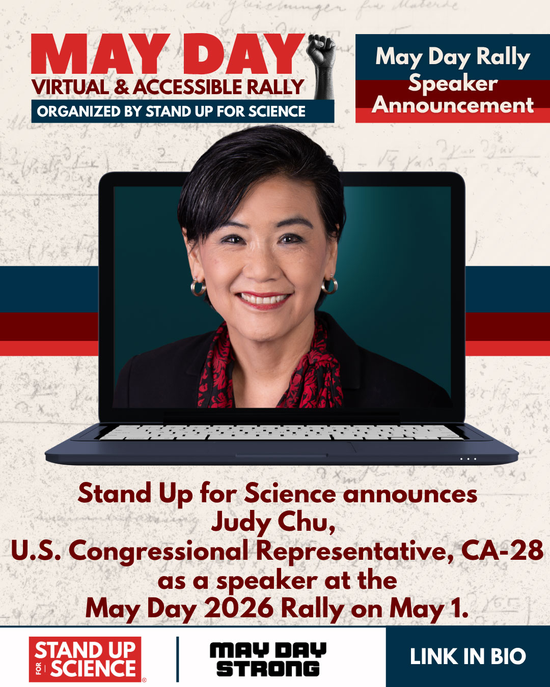
May Day Speaker
Accessibility Is a Design Decision
Making the event fully accessible—ASL, Spanish translation, live captioning—wasn't lip service or a checkbox. It clearly signaled the event was truly for everyone. The response from attendees made that concrete: so many people felt like they were participating in the democratic process, in a format they could actually access. Designing with that in mind, and promoting it clearly, is what made the difference.
Process Is Creative Work Too
The go/no-go readiness check I introduced for Earth Day isn't new or glamorous, but it made us launch on time. When you're coordinating creative across communications, production, and logistics teams under a tight timeline, asking "Are you ready to go, or what do you need to get there?" gets clear, concrete answers everyone can act on. Making that a structured check—every team, every time—kept us from going live into preventable problems.
What I'd Do Differently
More lead time for speakers—with more time and assets, speakers could have promoted the events to their own followers, and we could have spread out announcements with more detail to draw more people in
Engage more high-profile accounts—asking more social media allies to share the event with their audiences would have spread our message much wider
Advertise—we didn't have a system in place, but even a small budget could have extended our reach well beyond organic social
Document the system—I built and expanded the visual system across three events largely in my head. A proper style guide from the start would have made it easier to bring in others and scale